
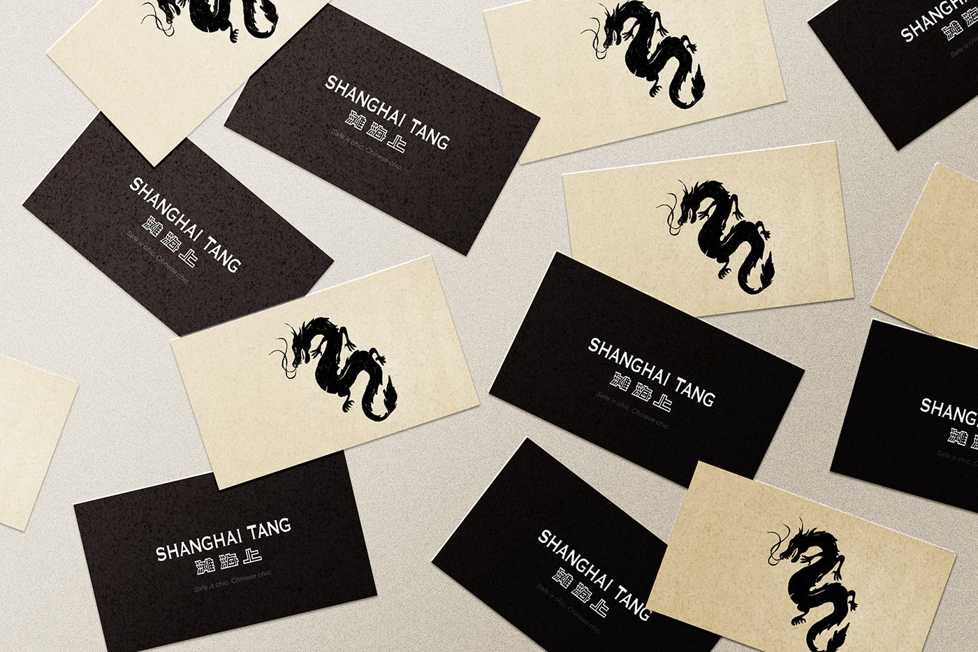
Safe is chic. Chinese chic - Shanghai Tang advertisement
The end of the first year of my studies enabled me to interact with animation design for the very first time in my life. The given task was to chose one brand of the ones listed by our brief and design an animated 30-seconds advertisement with a wanted narrative. I have decided to work with the Chinese fashion brand Shanghai Tang, as getting to know a company from a different part of the world, therefore exploring a different culture, would be a new, challenging experience for me.
The animation's style of illustration was inspired by traditional Chinese paintings with ink and calligraphy brushes on ecru paper. All the elements that present brand's products are being coloured according to the authentic products - except for the face coverings, which are additional elements of my narration (see below).
The advertisement is a stop-motion animation, consisting of 480 hand-drawn frames. Each frame of the animation was drawn by me by hand in Procreate, using my iPad and Apple Pencil.
24.05.2021
Do not copy or repost.
My animation was aimed towards the European audience in the age of 25-45. The intention of my advertisement was to present the brand and the whole Chinese culture to my consumers, interesting them in the company's heritage and roots while encouraging them into exploring more about the traditional culture of China. What is more, since I wanted to take advantage of my previous projects focusing on using the graphic design as a medium of raising awareness on specific subjects and highlighting the social issues, I wanted my ad to also promote staying safe during the COVID-19 pandemic. Since I have met with numerous incidents in which people refused to wear face coverings, I wanted to use my animation to also encourage my audience into wearing face masks, as being safe and responsible does not mean being unfashionable.


Each element that I have included in my animation is a significant aspect for the Shanghai Tang brand. All the elements that are coloured present the company's products - except for the face coverings, which are visual representations of my "hidden" narrative. Other than the masks, each illustration presents either the Shanghai Tang's history - as the buldings, being one of the first locations of the brand - or are visual representation of the company's philosophy, heritage and inspiration, which is strongly associated with the traditional Chinese art and culture.
To interest my target audience the most, I have included all the elements of Chinese culture that are familiar for Europeans and are considered impressive for most of my consumers (according to an internet survey I have conducted during my project's research). That way I could communicate my ideas more effectively and encourage the users into exploring the subject even further - thanks to the sense of the growing "excitement" of my advertisement.


The part of designing this project that I found the most challenging and took the most time and energy was drawing the frames. As I wanted my advertisement to be a stop-motion animation, which illustrations would create a sense of "moving ink", I drew each frame separately, working in the Procreate app. At the end I had a total of 480 frames, which I had to animate in Adobe After Effects in a 30-seconds ad.
The music I have used in the background is a Chinese New Year Celebration Music by Derek and Brandon Fiechter and the voice over at the end was made with the help of my friend Zeyu.


Thank you!


